

New estimates screen
Estimating Translation Projects Cost and Delivery
Interaction Design
Information Design
User Research
Prototyping
The estimates screen was the most complex piece of the $6M workflow redesign, and the most critical: it was where users decided whether to commit to a project or walk away. Users couldn't submit without knowing cost and delivery timing, and the old version showed neither. I redesigned it around progressive disclosure, surfacing cost by file, language, and translation step alongside delivery estimates. Usability testing showed 92% task success, and Customer Support reported faster issue resolution after launch.
My role
I was the sole Product Designer and acting Product Manager on this initiative. I owned discovery, product requirements, design direction, and coordination with engineering across multiple phased releases.
Why a single screen mattered this much
For legacy users, estimates were a nice-to-have. For the acquired clients, they were a blocker. These users needed cost numbers to get internal budget approval and delivery dates to quote their own clients. Without that information they either submitted projects blind or went back to asking account managers, which defeated the entire point of self-service we were building toward.
So this screen carried the weight of the whole migration. If users couldn't trust what it told them, they wouldn't move off the manual, account-manager-led model the redesign was meant to replace.
What was missing

Information on how long the project would take to be complete
Total project cost
Total cost per file and breakdown per language
Progressive disclosure, decision by decision
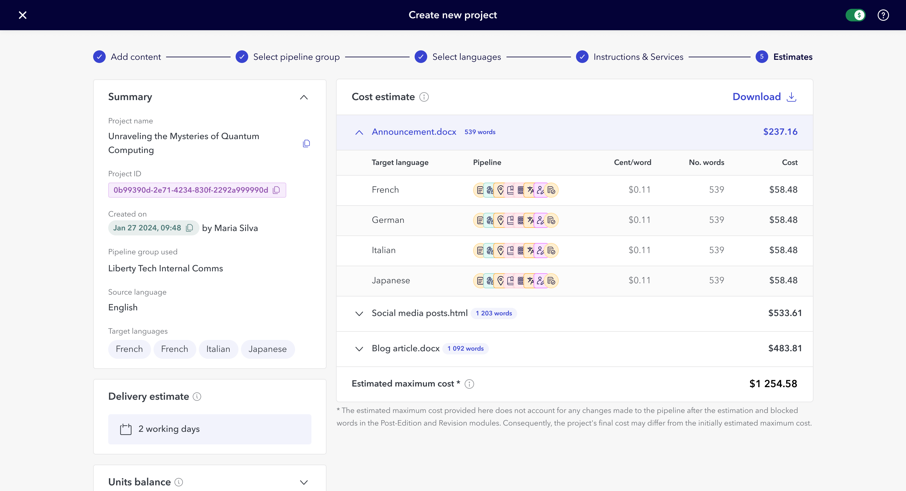
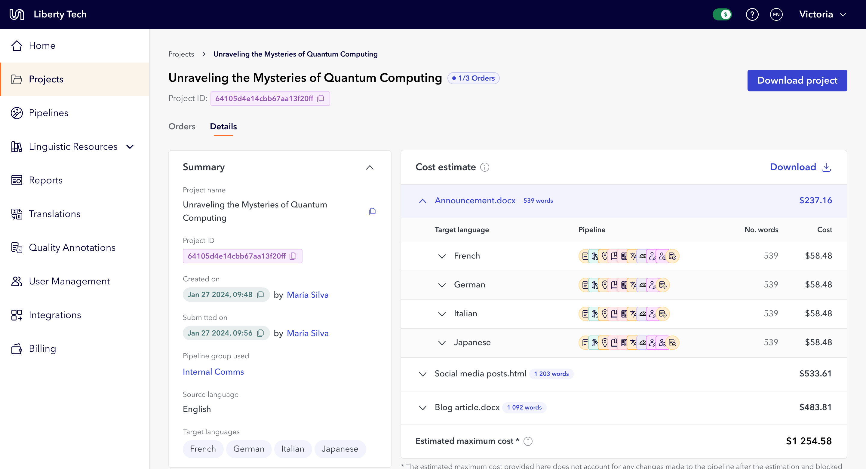
I structured the estimates screen around progressive disclosure and modular design. The same UI appears in both the submission process and the project details after submission. The goal was to show as much information as possible, without it becoming overwhelming or confusing, and over-index on transparency.
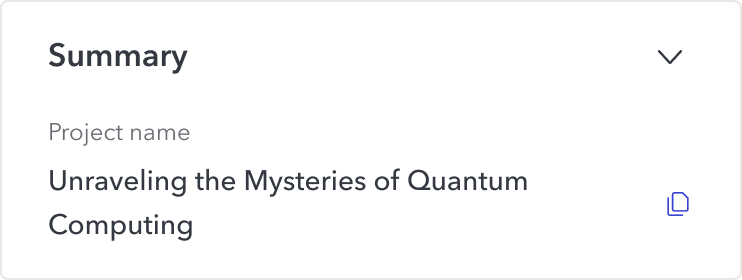
Project summary card
A project summary card, because users kept losing their place. At first, estimates were instant; users get an email when one is ready, then return to Portal. Many forgot which project they were even looking at and had to dig back through email, and when something went wrong they couldn't find the details Customer Support needed. I added a collapsible summary card showing project name and key details. Customer Support reported clearer communication from users after launch.
Collapsed summary card
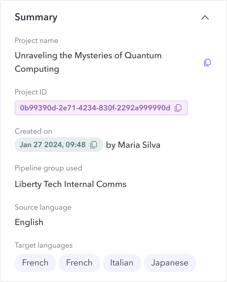
Uncollapsed summary card
Delivery estimate
A delivery estimate card, because timing was the second-most-common ask. I added a card showing expected completion date. Account Managers reported it improved user confidence in the service.
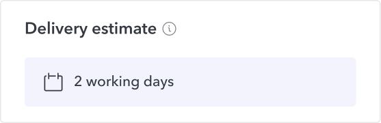
Delivery estimate card
Cost breakdown per file
Each project can have multiple files, and each file has its own cost calculated per word and language. The more words, the higher the cost. But price also depends on the target language, as each can have different settings like quality tiers or multiple human editors that affect the final price. The user needs to be able to decide if they want to submit the project, remove files or remove target languages to drive the price down.
Grouping by file made the numbers manageable: users see how each file contributes to the total, then drill into language and translation step only if they want to. It mirrors how they actually think about a project.
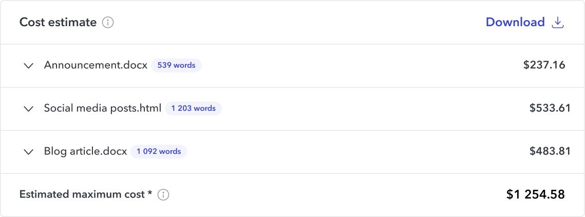
Collapsed cost estimate card
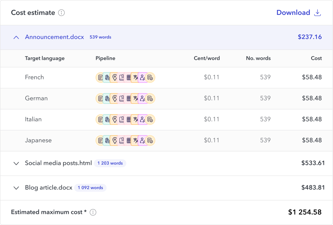
Uncollapsed cost estimate card
Redesigned estimates information
Project submission step
Project detail
Validation
I ran an unmoderated usability test with 17 users. 58% completed it, and of those, 92.3% successfully completed the tasks.
"I'm very happy with the prototype look. I like the fact that project name is included, along with the dollar amount. I think that most of our concerns were addressed here." Test participant
What changed
The screen gave users what they needed to self-serve: cost visibility for budget approval, delivery timelines for their own clients, and clear project details for troubleshooting. Customer Support reported faster issue resolution and clearer communication.
Reflection
Transparency builds trust, especially during change. These users came from a model built on email and account managers, and showing them exactly what they needed, where they needed it, was what let them adapt.
What I'd read differently now is the test result. 92% task success is really 92% of the 58% who completed the unmoderated test, so the honest number carries the denominator, not just the clean headline. And the test itself was a weak instrument: a 42% non-completion rate on an unmoderated study makes the data noisy, and on the most critical screen of the whole migration, seventeen participants in a format I couldn't observe was thin validation. I'd run it moderated next time, so I could watch where people actually stalled in the task rather than inferring anything from who finished.
I'd also question progressive disclosure here. It keeps the screen calm, but these users' real job was to pull specific per-file and per-language numbers into a budget request or a client quote, and hiding detail by default may have worked against that. A denser, more scannable layout might have served the task better.
I left Unbabel before I could run discovery on where this screen actually needed to improve, so these are open questions I never got to test.


New estimates screen
Estimating Translation Projects Cost and Delivery
Interaction Design
Information Design
User Research
Prototyping
The estimates screen was the most complex piece of the $6M workflow redesign, and the most critical: it was where users decided whether to commit to a project or walk away. Users couldn't submit without knowing cost and delivery timing, and the old version showed neither. I redesigned it around progressive disclosure, surfacing cost by file, language, and translation step alongside delivery estimates. Usability testing showed 92% task success, and Customer Support reported faster issue resolution after launch.
My role
I was the sole Product Designer and acting Product Manager on this initiative. I owned discovery, product requirements, design direction, and coordination with engineering across multiple phased releases.
Why a single screen mattered this much
For legacy users, estimates were a nice-to-have. For the acquired clients, they were a blocker. These users needed cost numbers to get internal budget approval and delivery dates to quote their own clients. Without that information they either submitted projects blind or went back to asking account managers, which defeated the entire point of self-service we were building toward.
So this screen carried the weight of the whole migration. If users couldn't trust what it told them, they wouldn't move off the manual, account-manager-led model the redesign was meant to replace.
What was missing
Information on how long the project would take to be complete
Total project cost
Total cost per file and breakdown per language
Progressive disclosure, decision by decision
I structured the estimates screen around progressive disclosure and modular design. The same UI appears in both the submission process and the project details after submission. The goal was to show as much information as possible, without it becoming overwhelming or confusing, and over-index on transparency.
Project summary card
A project summary card, because users kept losing their place. At first, estimates were instant; users get an email when one is ready, then return to Portal. Many forgot which project they were even looking at and had to dig back through email, and when something went wrong they couldn't find the details Customer Support needed. I added a collapsible summary card showing project name and key details. Customer Support reported clearer communication from users after launch.
Collapsed summary card
Uncollapsed summary card
Delivery estimate
A delivery estimate card, because timing was the second-most-common ask. I added a card showing expected completion date. Account Managers reported it improved user confidence in the service.
Delivery estimate card
Cost breakdown per file
Each project can have multiple files, and each file has its own cost calculated per word and language. The more words, the higher the cost. But price also depends on the target language, as each can have different settings like quality tiers or multiple human editors that affect the final price. The user needs to be able to decide if they want to submit the project, remove files or remove target languages to drive the price down.
Grouping by file made the numbers manageable: users see how each file contributes to the total, then drill into language and translation step only if they want to. It mirrors how they actually think about a project.
Collapsed cost estimate card
Uncollapsed cost estimate card
Redesigned estimates information
Project submission step
Project detail
Validation
I ran an unmoderated usability test with 17 users. 58% completed it, and of those, 92.3% successfully completed the tasks.
"I'm very happy with the prototype look. I like the fact that project name is included, along with the dollar amount. I think that most of our concerns were addressed here." Test participant
What changed
The screen gave users what they needed to self-serve: cost visibility for budget approval, delivery timelines for their own clients, and clear project details for troubleshooting. Customer Support reported faster issue resolution and clearer communication.
Reflection
Transparency builds trust, especially during change. These users came from a model built on email and account managers, and showing them exactly what they needed, where they needed it, was what let them adapt.
What I'd read differently now is the test result. 92% task success is really 92% of the 58% who completed the unmoderated test, so the honest number carries the denominator, not just the clean headline. And the test itself was a weak instrument: a 42% non-completion rate on an unmoderated study makes the data noisy, and on the most critical screen of the whole migration, seventeen participants in a format I couldn't observe was thin validation. I'd run it moderated next time, so I could watch where people actually stalled in the task rather than inferring anything from who finished.
I'd also question progressive disclosure here. It keeps the screen calm, but these users' real job was to pull specific per-file and per-language numbers into a budget request or a client quote, and hiding detail by default may have worked against that. A denser, more scannable layout might have served the task better.
I left Unbabel before I could run discovery on where this screen actually needed to improve, so these are open questions I never got to test.

New estimates screen
Estimating Translation Projects Cost and Delivery
Interaction Design
Information Design
User Research
Prototyping
The estimates screen was the most complex piece of the $6M workflow redesign, and the most critical: it was where users decided whether to commit to a project or walk away. Users couldn't submit without knowing cost and delivery timing, and the old version showed neither. I redesigned it around progressive disclosure, surfacing cost by file, language, and translation step alongside delivery estimates. Usability testing showed 92% task success, and Customer Support reported faster issue resolution after launch.
My role
Sole designer and acting PM, reporting to the Director of Product. I owned discovery, product requirements, design direction, and engineering coordination across multiple phased releases.
Why a single screen mattered this much
For legacy users, estimates were a nice-to-have. For the acquired clients, they were a blocker. These users needed cost numbers to get internal budget approval and delivery dates to quote their own clients. Without that information they either submitted projects blind or went back to asking account managers, which defeated the entire point of self-service we were building toward.
So this screen carried the weight of the whole migration. If users couldn't trust what it told them, they wouldn't move off the manual, account-manager-led model the redesign was meant to replace.
What was missing
Information on how long the project would take to be complete
Total project cost
Total cost per file and breakdown per language
Search, filtering and sorting options
Progressive disclosure, decision by decision
I structured the estimates screen around progressive disclosure and modular design. The same UI appears in both the submission process and the project details after submission. The goal was to show as much information as possible, without it becoming overwhelming or confusing, and over-index on transparency.
Project summary card
A project summary card, because users kept losing their place. At first, estimates were instant; users get an email when one is ready, then return to Portal. Many forgot which project they were even looking at and had to dig back through email, and when something went wrong they couldn't find the details Customer Support needed. I added a collapsible summary card showing project name and key details. Customer Support reported clearer communication from users after launch.
Collapsed summary card
Uncollapsed summary card
Delivery estimate
A delivery estimate card, because timing was the second-most-common ask. I added a card showing expected completion date. Account Managers reported it improved user confidence in the service.
Delivery estimate card
Cost breakdown by file
Each project can have multiple files, and each file has its own cost calculated per word and language. The more words, the higher the cost. But price also depends on the target language, as each can have different settings like quality tiers or multiple human editors that affect the final price. The user needs to be able to decide if they want to submit the project, remove files or remove target languages to drive the price down.
Grouping by file made the numbers manageable: users see how each file contributes to the total, then drill into language and translation step only if they want to. It mirrors how they actually think about a project.
Collapsed cost estimate card
Uncollapsed cost estimate card
Redesigned estimates information
Project submission step
Project detail
Validation
I ran an unmoderated usability test with 17 users. 58% completed it, and of those, 92.3% successfully completed the tasks.
"I'm very happy with the prototype look. I like the fact that project name is included, along with the dollar amount. I think that most of our concerns were addressed here." Test participant
What changed
The screen gave users what they needed to self-serve: cost visibility for budget approval, delivery timelines for their own clients, and clear project details for troubleshooting. Customer Support reported faster issue resolution and clearer communication.
Reflection
Transparency builds trust, especially during change. These users came from a model built on email and account managers, and showing them exactly what they needed, where they needed it, was what let them adapt.
What I'd read differently now is the test result. 92% task success is really 92% of the 58% who completed the unmoderated test, so the honest number carries the denominator, not just the clean headline. And the test itself was a weak instrument: a 42% non-completion rate on an unmoderated study makes the data noisy, and on the most critical screen of the whole migration, seventeen participants in a format I couldn't observe was thin validation. I'd run it moderated next time, so I could watch where people actually stalled in the task rather than inferring anything from who finished.
I'd also question progressive disclosure here. It keeps the screen calm, but these users' real job was to pull specific per-file and per-language numbers into a budget request or a client quote, and hiding detail by default may have worked against that. A denser, more scannable layout might have served the task better.
I left Unbabel before I could run discovery on where this screen actually needed to improve, so these are open questions I never got to test.