

Redesigned home page
Platform Redesign: 5% Retention Increase, 42% More Orders
Team Leadership
Information Architecture
Design Systems
Data Visualization
In a tree test with 37 internal users, not one could find where to create a translation project on their first try, and creating translations was the entire point of Unbabel's Portal. Years of patchwork development had left an interface so inconsistent that users leaned on account managers for tasks they should have done themselves. I proposed a full redesign, built the business case through research and audits, and led the nine-month initiative.
The result: 5% higher retention and 42% more translation submissions, directly increasing revenue.
My role
Solo designer, reporting to the Director of Product. I followed this project after identifying the scope of full value, served as design lead and had final say on the approach, negotiating process through, I served as a type lead and technical liaison to stakeholders.
The signal: account managers doing the users' job
Portal's inconsistent interface made users unable to complete tasks independently. They relied on Account Managers for basic actions like creating projects, exporting data, and pulling reports.
Most importantly, a tree test revealed that 70% of the tested internal users couldn't find where to order a translation on their first try. This was the platform's main revenue action. If users familiar with the tool couldn't find it, real users wouldn't either.
Main identified problems

Main revenue action (ordering translations) hidden under a mislabeled submenu
Confusing entry point names that didn't match user expectations
No rules for icon usage, button types, or copy patterns across the platform
Inconsistent button placement on cards
No clear indication of primary vs secondary actions on each page
Users couldn't independently create projects, export data, or pull reports
No design system with clear rules for page assembly, component usage or copy
Search, filtering and sorting options
Portal’s previous UI and experience
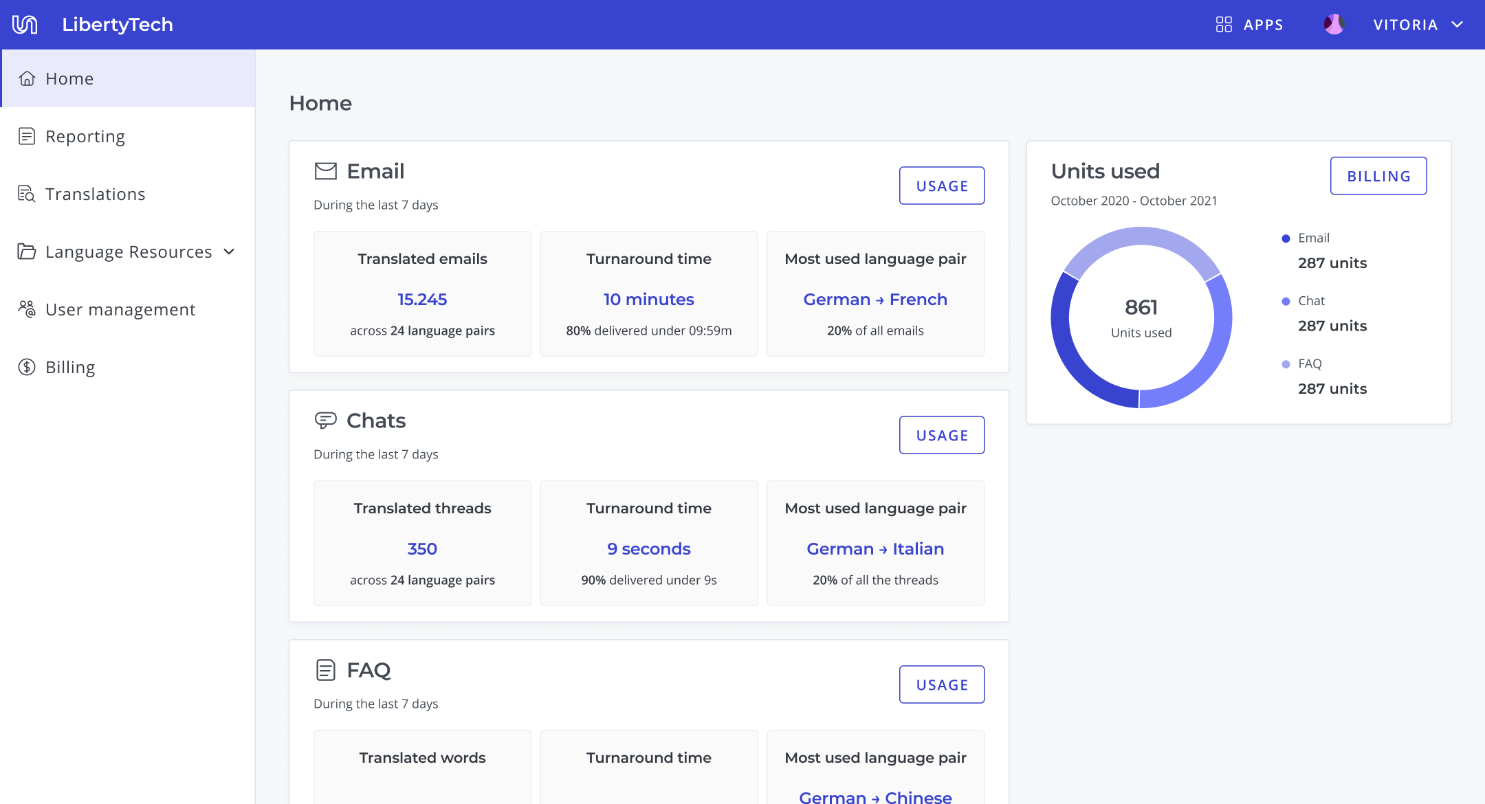
Home
Usage Reporting
Quality reporting
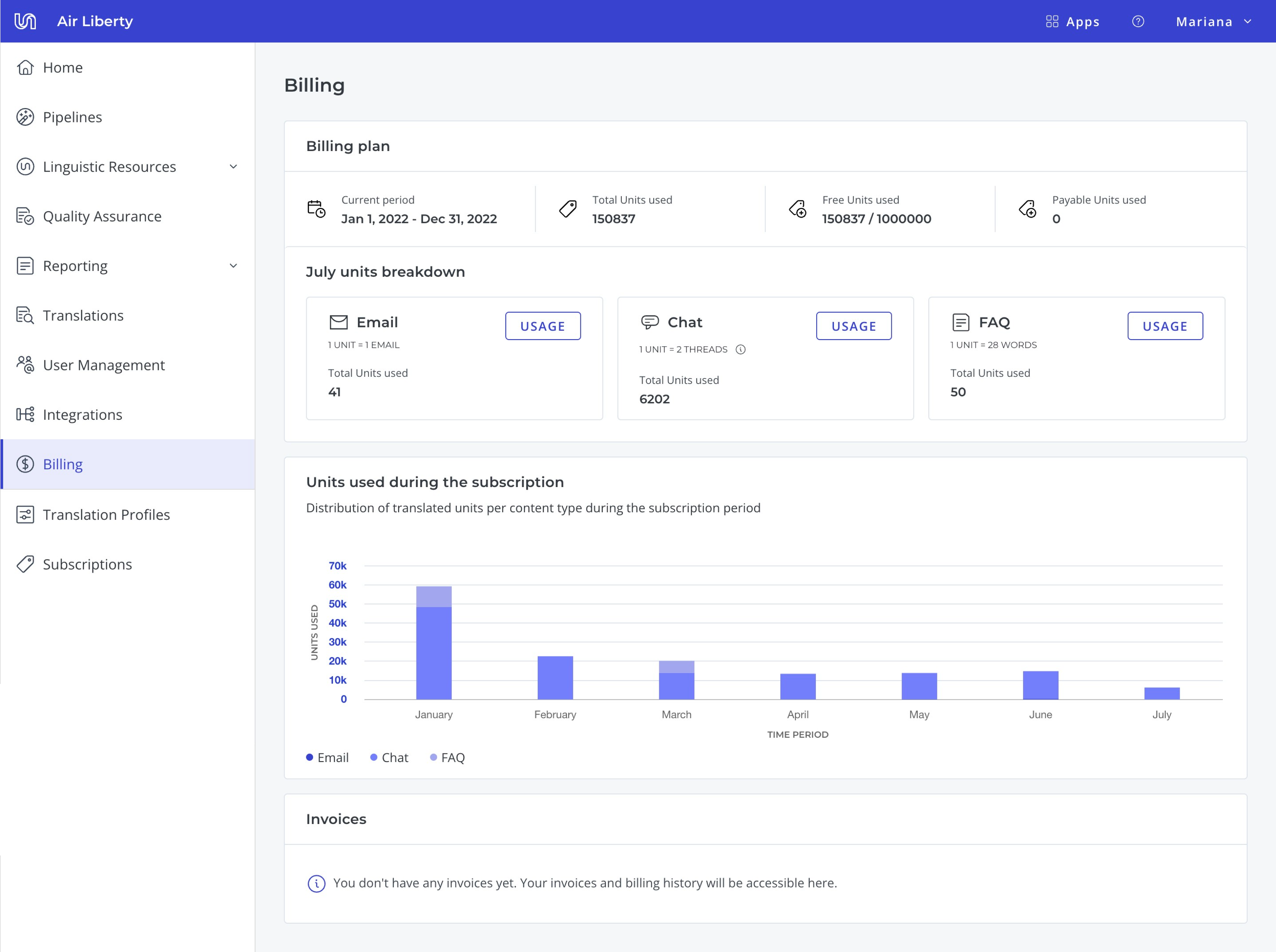
Billing
Selling the redesign
When I presented the audit, engineering and the Director of Product were skeptical. Another redesign, more work, unclear payoff. The tree-test result cut through that. Securing engineering took more than a stat: a full redesign meant rebuilding the design system on top of an existing roadmap. What shifted the conversation was framing it as a technical challenge, not design cleanup, and agreeing to run implementation in parallel with other initiatives rather than displacing them. Slower delivery, but their buy-in held across the full nine months. I owned every design decision, from research approach to information architecture to the component system, and influenced implementation priorities with engineering.
One constraint: no team loses functionality
I approached the redesign with one constraint: no team loses functionality. The goal was to make Portal more discoverable and usable, not to simplify by cutting. This meant every existing feature had to find a logical home in the new system, and information at the page level had to be rearranged to better fit users' journeys when completing their jobs-to-be-done.
This resulted in a new information architecture: moving the translation projects entry point to the main navigation, as well as renaming it and other entry points to better match the users’ mental models.
Information architecture
Problem
Fundamental actions, like ordering translations, were hidden in low visibility menus. Entry points labelling was confusing, often users interpret “Reporting” as the option to report translation issues and not the page where they can find usage, quality and speed metrics;
Solution
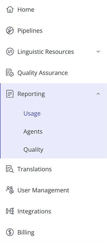
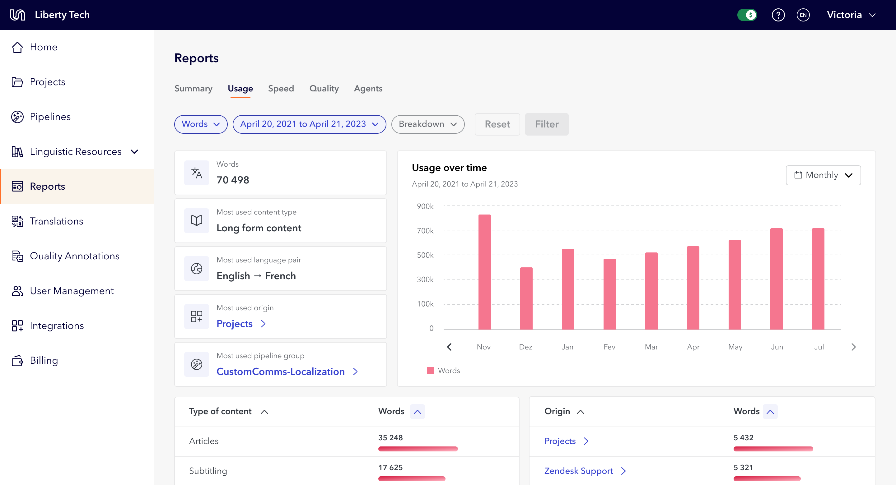
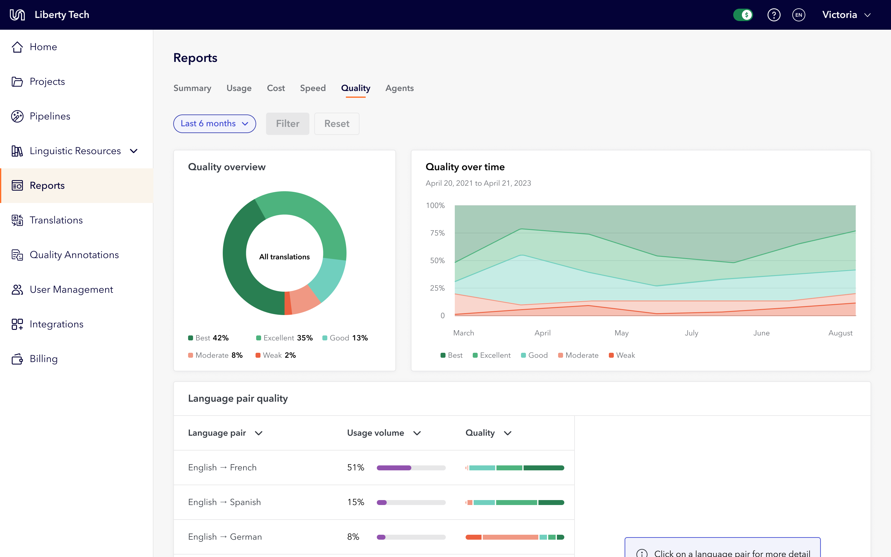
The navigation bar entry points were reorganised and renamed to better fit users' mental models. Dropdown menus were limited to aggregating related functionalities. For the reporting app, I replaced drop downs with page tabs, making it easier for users to compare metrics across number of translated words, speed, quality, and cost.
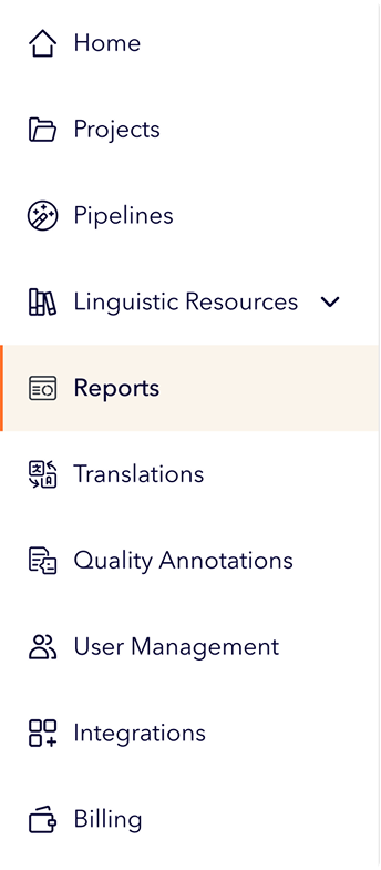
Previous navigation bar
Redesigned navigation bar
Primary and Secondary actions
Problem
Actions had no consistency. Icons on some buttons but not others. Copy alternated between "New object" and "Create object" with no pattern. Dropdown buttons used arbitrarily. Card-level actions appeared in all four corners with random button types.
Solution
I created rules that distinguished page-level from card-level actions, standardized placement and copy patterns, and established when to use icons and drop downs. The principle: the user's primary job-to-be-done on each page should be the first thing they see.
Shipping a new Portal
Implementing these rules across the entire platform at the same time wasn't realistic given engineering capacity. I worked with the front-end team to prioritise: we identified which patterns appeared most frequently and which were high-visibility, and focused there first. Lower-frequency components were updated as part of other initiatives that required those components. This collaborative prioritisation kept the project moving without overloading the team.
What I shipped:

New information architecture that ensured consistent wayfinding
Refreshed design system with rules on copy, component use, and page organisation
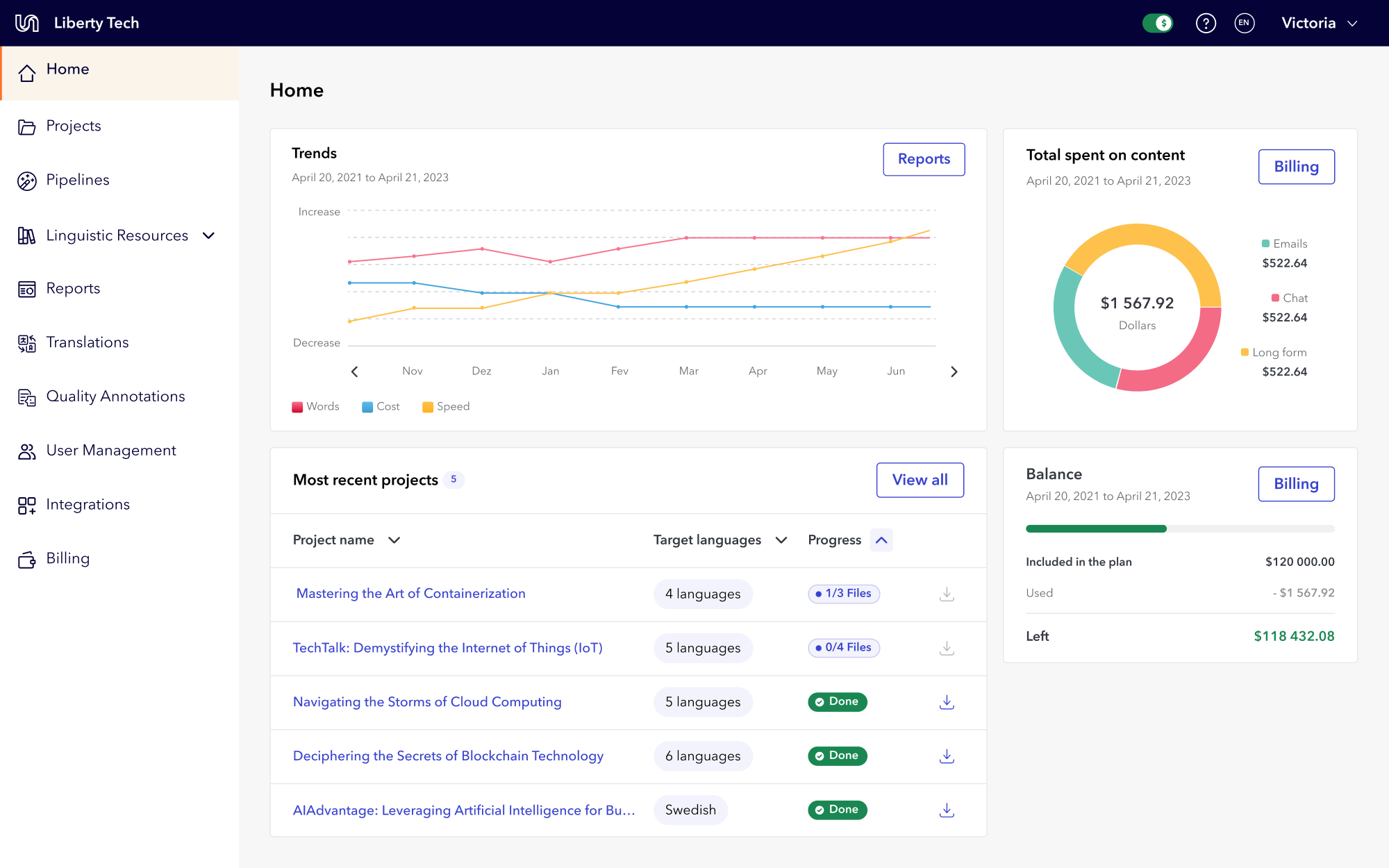
New home page where users could easily access metrics, translation projects, and subscription information
New reports app that allowed users to navigate between multiple metric dimensions
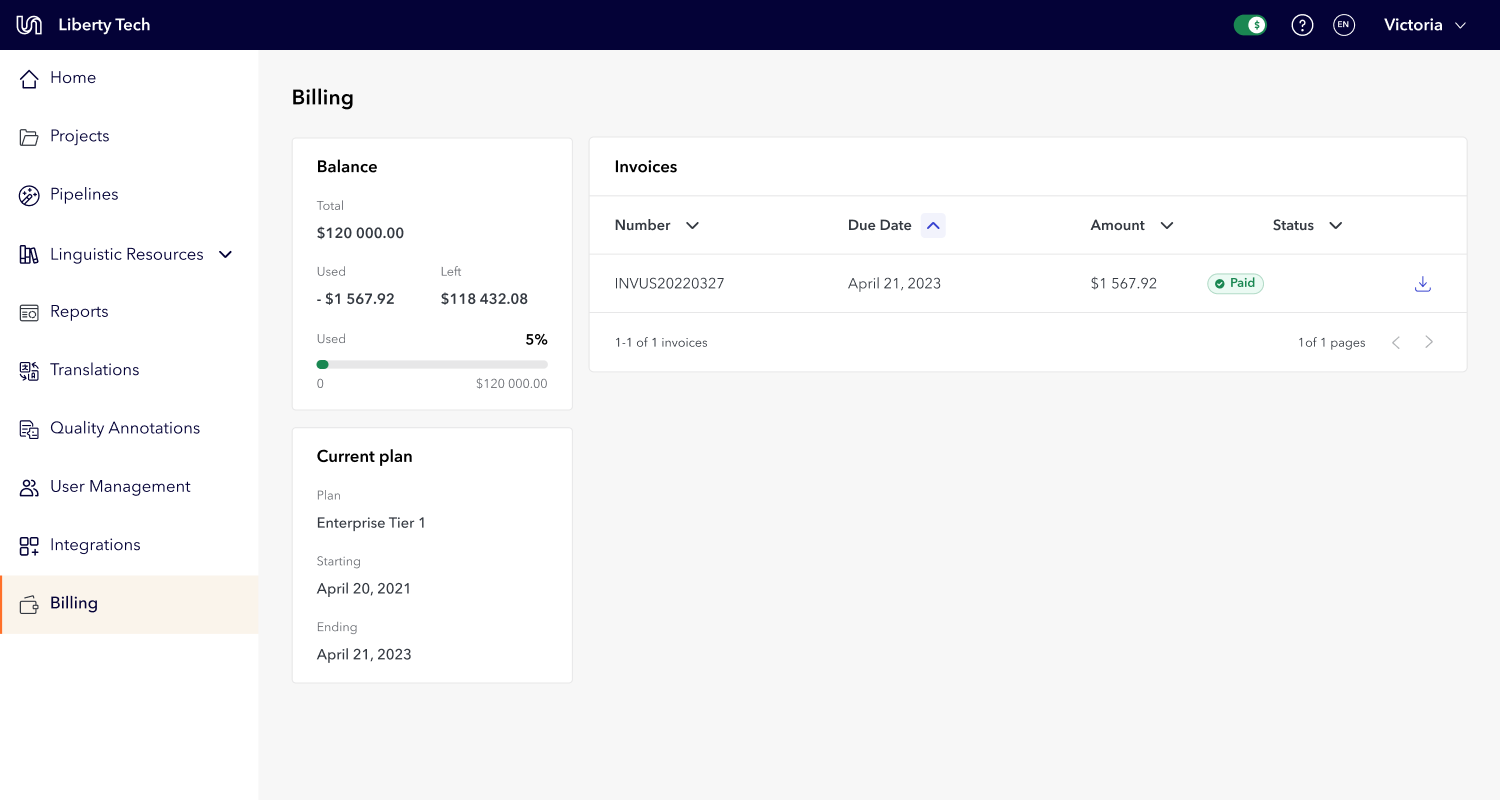
New billing app that allowed users to track invoices and view subscription status
Redesigned experience
Home
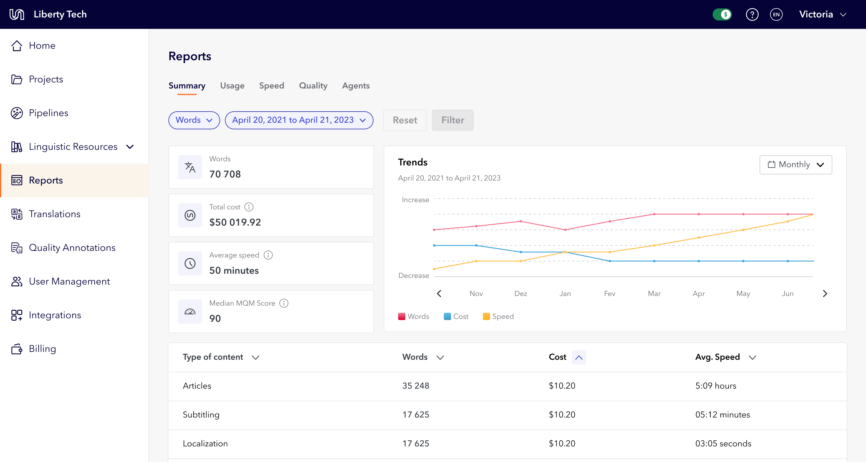
Summary report
Usage report
Quality report
Billing
Impact
The redesign solved the problem I'd started with: users could complete tasks independently, and Account Managers were no longer doing the Portal's job for them. Support tickets decreased, task completion became faster, and Account Managers could return to their actual jobs instead of creating projects and pulling reports on behalf of clients.
Beyond usability, the redesign gave Portal a premium, modern look that increased trust in the platform. The push for standardization meant users knew what to expect when taking any action and where to find the information they needed.
Key results
Comparing Comparing three months after release to three months before: users stayed in the app for longer, and submitted more projects. We also saw less error clicks and fewer support tickets being raised for tasks the user could complete on their own, like filter their usage data.
User retention

5%
Submitted projects
42%
Error clicks
20%
Reflection
If I did this again, I'd involve engineering earlier, and differently. I brought them in to secure buy-in, but I should have first asked what problems they were facing with the design system and tech stack. Understanding their pain before asking for commitment would have made them partners from the start, not implementers at the end.
I'd also revisit the constraint I set, that no team loses functionality. It kept the politics manageable, but it stopped me asking the more useful question: which features had near-zero usage and shouldn't have survived the redesign at all. I had the data to cut, and I chose to rehouse everything instead.
Lastly, I'd also have run usability testing after the full release and kept iterating. Other initiatives took priority, so the redesign shipped but wasn't revisited the way I'd hoped. This project confirmed what I want more of: long-term, systems-level work where I can tie user impact to a business metric.


Redesigned home page
Platform Redesign: 5% Retention Increase, 42% More Orders
Team Leadership
Information Architecture
Design Systems
Data Visualization
In a tree test with 37 internal users, not one could find where to create a translation project on their first try, and creating translations was the entire point of Unbabel's Portal. Years of patchwork development had left an interface so inconsistent that users leaned on account managers for tasks they should have done themselves. I proposed a full redesign, built the business case through research and audits, and led the nine-month initiative.
The result: 5% higher retention and 42% more translation submissions, directly increasing revenue.
My role
Solo designer, reporting to the Director of Product. I followed this project after identifying the scope of full value, served as design lead and had final say on the approach, negotiating process through, I served as a type lead and technical liaison to stakeholders.
The signal: account managers doing the users' job
Portal's inconsistent interface made users unable to complete tasks independently. They relied on Account Managers for basic actions like creating projects, exporting data, and pulling reports.
Most importantly, a tree test revealed that 70% of the tested internal users couldn't find where to order a translation on their first try. This was the platform's main revenue action. If users familiar with the tool couldn't find it, real users wouldn't either.
Main identified problems
Main revenue action (ordering translations) hidden under a mislabeled submenu
Confusing entry point names that didn't match user expectations
No rules for icon usage, button types, or copy patterns across the platform
Inconsistent button placement on cards
No clear indication of primary vs secondary actions on each page
Users couldn't independently create projects, export data, or pull reports
No design system with clear rules for page assembly, component usage or copy
Search, filtering and sorting options
Portal’s previous UI and experience
Scroll horizontally to see all screenshots
Home
Usage Reporting
Quality reporting
Billing
Selling the redesign
When I presented the audit, engineering and the Director of Product were skeptical. Another redesign, more work, unclear payoff. The tree-test result cut through that. Securing engineering took more than a stat: a full redesign meant rebuilding the design system on top of an existing roadmap. What shifted the conversation was framing it as a technical challenge, not design cleanup, and agreeing to run implementation in parallel with other initiatives rather than displacing them. Slower delivery, but their buy-in held across the full nine months. I owned every design decision, from research approach to information architecture to the component system, and influenced implementation priorities with engineering.
One constraint: no team loses functionality
I approached the redesign with one constraint: no team loses functionality. The goal was to make Portal more discoverable and usable, not to simplify by cutting. This meant every existing feature had to find a logical home in the new system, and information at the page level had to be rearranged to better fit users' journeys when completing their jobs-to-be-done.
This resulted in a new information architecture: moving the translation projects entry point to the main navigation, as well as renaming it and other entry points to better match the users’ mental models.
Information architecture
Problem
Fundamental actions, like ordering translations, were hidden in low visibility menus. Entry points labelling was confusing, often users interpret “Reporting” as the option to report translation issues and not the page where they can find usage, quality and speed metrics;
Solution
The navigation bar entry points were reorganised and renamed to better fit users' mental models. Dropdown menus were limited to aggregating related functionalities. For the reporting app, I replaced drop downs with page tabs, making it easier for users to compare metrics across number of translated words, speed, quality, and cost.
Previous navigation bar
Redesigned navigation bar
Primary and Secondary actions
Problem
Actions had no consistency. Icons on some buttons but not others. Copy alternated between "New object" and "Create object" with no pattern. Dropdown buttons used arbitrarily. Card-level actions appeared in all four corners with random button types.
Solution
I created rules that distinguished page-level from card-level actions, standardized placement and copy patterns, and established when to use icons and drop downs. The principle: the user's primary job-to-be-done on each page should be the first thing they see.
Shipping a new Portal
Implementing these rules across the entire platform at the same time wasn't realistic given engineering capacity. I worked with the front-end team to prioritise: we identified which patterns appeared most frequently and which were high-visibility, and focused there first. Lower-frequency components were updated as part of other initiatives that required those components. This collaborative prioritisation kept the project moving without overloading the team.
What I shipped:
New information architecture that ensured consistent wayfinding
Refreshed design system with rules on copy, component use, and page organisation
New home page where users could easily access metrics, translation projects, and subscription information
New reports app that allowed users to navigate between multiple metric dimensions
New billing app that allowed users to track invoices and view subscription status
Redesigned experience
Scroll horizontally to see all screenshots
Home
Summary report
Usage report
Quality report
Billing
Impact
The redesign solved the problem I'd started with: users could complete tasks independently, and Account Managers were no longer doing the Portal's job for them. Support tickets decreased, task completion became faster, and Account Managers could return to their actual jobs instead of creating projects and pulling reports on behalf of clients.
Beyond usability, the redesign gave Portal a premium, modern look that increased trust in the platform. The push for standardization meant users knew what to expect when taking any action and where to find the information they needed.
Key results
Comparing Comparing three months after release to three months before: users stayed in the app for longer, and submitted more projects. We also saw less error clicks and fewer support tickets being raised for tasks the user could complete on their own, like filter their usage data.
User retention

5%
Submitted projects
42%
Error clicks
20%
Reflection
If I did this again, I'd involve engineering earlier, and differently. I brought them in to secure buy-in, but I should have first asked what problems they were facing with the design system and tech stack. Understanding their pain before asking for commitment would have made them partners from the start, not implementers at the end.
I'd also revisit the constraint I set, that no team loses functionality. It kept the politics manageable, but it stopped me asking the more useful question: which features had near-zero usage and shouldn't have survived the redesign at all. I had the data to cut, and I chose to rehouse everything instead.
Lastly, I'd also have run usability testing after the full release and kept iterating. Other initiatives took priority, so the redesign shipped but wasn't revisited the way I'd hoped. This project confirmed what I want more of: long-term, systems-level work where I can tie user impact to a business metric.

Redesigned home page
Platform Redesign: 5% Retention Increase, 42% More Orders
Team Leadership
Information Architecture
Design Systems
Data Visualization
In a tree test with 37 internal users, not one could find where to create a translation project on their first try, and creating translations was the entire point of Unbabel's Portal. Years of patchwork development had left an interface so inconsistent that users leaned on account managers for tasks they should have done themselves. I proposed a full redesign, built the business case through research and audits, and led the nine-month initiative.
The result: 5% higher retention and 42% more translation submissions, directly increasing revenue.
My role
Solo designer, reporting to the Director of Product. I followed this project after identifying the scope of full value, served as design lead and had final say on the approach, negotiating process through, I served as a type lead and technical liaison to stakeholders.
The signal: account managers doing the users' job
Portal's inconsistent interface made users unable to complete tasks independently. They relied on Account Managers for basic actions like creating projects, exporting data, and pulling reports.
Most importantly, a tree test revealed that 70% of the tested internal users couldn't find where to order a translation on their first try. This was the platform's main revenue action. If users familiar with the tool couldn't find it, real users wouldn't either.
Main identified problems
Main revenue action (ordering translations) hidden under a mislabeled submenu
Confusing entry point names that didn't match user expectations
No rules for icon usage, button types, or copy patterns across the platform
Inconsistent button placement on cards
No clear indication of primary vs secondary actions on each page
Users couldn't independently create projects, export data, or pull reports
No design system with clear rules for page assembly, component usage or copy
Portal’s previous UI and experience
Home
Usage Reporting
Quality reporting
Billing
Selling the redesign
When I presented the audit, engineering and the Director of Product were skeptical. Another redesign, more work, unclear payoff. The tree-test result cut through that. Securing engineering took more than a stat: a full redesign meant rebuilding the design system on top of an existing roadmap. What shifted the conversation was framing it as a technical challenge, not design cleanup, and agreeing to run implementation in parallel with other initiatives rather than displacing them. Slower delivery, but their buy-in held across the full nine months. I owned every design decision, from research approach to information architecture to the component system, and influenced implementation priorities with engineering.
One constraint: no team loses functionality
I approached the redesign with one constraint: no team loses functionality. The goal was to make Portal more discoverable and usable, not to simplify by cutting. This meant every existing feature had to find a logical home in the new system, and information at the page level had to be rearranged to better fit users' journeys when completing their jobs-to-be-done.
This resulted in a new information architecture: moving the translation projects entry point to the main navigation, as well as renaming it and other entry points to better match the users’ mental models.
Information architecture
Problem
Fundamental actions, like ordering translations, were hidden in low visibility menus. Entry points labelling was confusing, often users interpret “Reporting” as the option to report translation issues and not the page where they can find usage, quality and speed metrics;
Solution
The navigation bar entry points were reorganised and renamed to better fit users' mental models. Dropdown menus were limited to aggregating related functionalities. For the reporting app, I replaced drop downs with page tabs, making it easier for users to compare metrics across number of translated words, speed, quality, and cost.
Previous navigation bar
Redesigned navigation bar
Primary and Secondary actions
Problem
Actions had no consistency. Icons on some buttons but not others. Copy alternated between "New object" and "Create object" with no pattern. Dropdown buttons used arbitrarily. Card-level actions appeared in all four corners with random button types.
Solution
I created rules that distinguished page-level from card-level actions, standardized placement and copy patterns, and established when to use icons and drop downs. The principle: the user's primary job-to-be-done on each page should be the first thing they see.
Shipping a new Portal
Implementing these rules across the entire platform at the same time wasn't realistic given engineering capacity. I worked with the front-end team to prioritise: we identified which patterns appeared most frequently and which were high-visibility, and focused there first. Lower-frequency components were updated as part of other initiatives that required those components. This collaborative prioritisation kept the project moving without overloading the team.
What changed
New information architecture that ensured consistent wayfinding
Refreshed design system with rules on copy, component use, and page organisation
New home page where users could easily access metrics, translation projects, and subscription information
New reports app that allowed users to navigate between multiple metric dimensions
New billing app that allowed users to track invoices and view subscription status
Redesigned experience
Home
Summary report
Usage report
Quality report
Billing
Impact
The redesign solved the problem I'd started with: users could complete tasks independently, and Account Managers were no longer doing the Portal's job for them. Support tickets decreased, task completion became faster, and Account Managers could return to their actual jobs instead of creating projects and pulling reports on behalf of clients.
Beyond usability, the redesign gave Portal a premium, modern look that increased trust in the platform. The push for standardization meant users knew what to expect when taking any action and where to find the information they needed.
Key results
Comparing Comparing three months after release to three months before: users stayed in the app for longer, and submitted more projects. We also saw less error clicks and fewer support tickets being raised for tasks the user could complete on their own, like filter their usage data.
User retention

5%
Submitted projects
42%
Error clicks
20%
Reflection
If I did this again, I'd involve engineering earlier, and differently. I brought them in to secure buy-in, but I should have first asked what problems they were facing with the design system and tech stack. Understanding their pain before asking for commitment would have made them partners from the start, not implementers at the end.
I'd also revisit the constraint I set, that no team loses functionality. It kept the politics manageable, but it stopped me asking the more useful question: which features had near-zero usage and shouldn't have survived the redesign at all. I had the data to cut, and I chose to rehouse everything instead.
Lastly, I'd also have run usability testing after the full release and kept iterating. Other initiatives took priority, so the redesign shipped but wasn't revisited the way I'd hoped. This project confirmed what I want more of: long-term, systems-level work where I can tie user impact to a business metric.